Pin It button on image hover

Friday, January 31, 2014

2014 Pantone Color of the Year :: Radiant Orchid


You've probably heard by now, Pantone's 2014 Color of the Year has been announced!

Let's hear it for Radiant Orchid!

{Via}

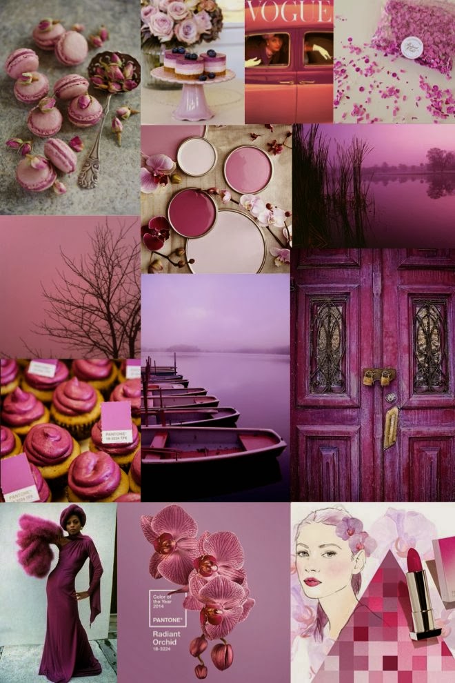
We love this collage by Sage + Sparkle, as it shows some of the many ways Radiant Orchid is popping up in our lives!

Leatrice Eiseman, executive director of the Pantone Color Institute, describes the color as "an enchanting harmony of fuchsia, purple, and pink undertones," and one that "inspires confidence and emanates great joy, love, and health. It is a captivating purple, one that draws you in with its beguiling charm." She goes on to say, "an invitation to innovation, Radiant Orchid encourages expanded creativity and originality, which is increasingly valued in today's society" (quote via Pantone).

Confidence, warmth, joy, creativity…as if we didn't already love this color, we love the descriptors they use, and the rationale behind choosing this color this year!

Radiant Orchid combines so beautifully with so many colors…gold, pink, navy, even cognac. We especially love it with other shades of purple. Remember these table numbers we did for Ashley & Jake's wedding?


The purple table numbers with gold calligraphy look stunning against a backdrop of purple, pink, and radiant orchid flowers :)

There are so many ways to use this inspiring color! Now that you know our feelings about it, what do you think of 2014's Color of the Year? Will you be incorporating it into your parties, wardrobe, or home decor? We'd love to know!

And for more Radiant Orchid inspiration, visit our Pinterest board:


Have a Happy Friday! :)

Wednesday, January 29, 2014

{Event Details} Tiffany-Inspired Birthday Invitations


Hi!

Today we're excited to share these Tiffany-inspired birthday invitations with you. First of all, who doesn't love a Tiffany-inspired party? Secondly, we love this color palette for this time of year, as the soft blue, white, and silvers are so pretty and wintery. 

One of our wonderful clients asked us if we would create a "Breakfast at Tiffany's" inspired invitation for her daughter, Reagan, who was turning five. We decided to play off the Tiffany box and do a square invitation, nestled in a robin's egg blue box, and adorned with the words "Reagan & Co."


Here is the enclosure, which was wrapped in double-sided satin ribbon and placed in a box.


The inside of the invitation is graced by an image of Ms. Hepburn herself! :)


The box


How pretty these"Tiffany" boxes look all lined up? :) 


Our client even found these beautiful Audrey Hepburn stamps to place on each invitation...


The finishing touch was wrapping the box in matching light blue paper and adorning it with a white sash, then writing each guest's address in calligraphy.

We still smile thinking about these invitations! How excited would your guests be to receive an invitation like this in the mail, and then join you for "breakfast" wearing their loveliest outfits? I think this kind of party would be enjoyed by ladies young and old! :)

For more Tiffany inspiration, visit our Pinterest board here:


And to see our other Tiffany-inspired invitations, go here and here.

Have a great day!

Monday, January 27, 2014

{Calligraphy Monday} Simple Calligraphy


It's Monday, which means we are sharing another calligraphy project with you…and today, we thought we'd keep it simple and elegant:


It's kind of hard to believe that it's already the end of January…it feels like we just had Christmas, then New Year's, and now here we are gearing up for Valentine's Day! Lately we've been reflecting on how we want to try and take time to enjoy the simple, everyday things that give us joy, and avoid the temptation to move on hurriedly to the next activity, event, holiday, etc. It's so easy to get caught up in the busyness, but our goal this year is to take the time to slow down, and really enjoy all the blessings we have. The joy is in the journey!

So we're keeping it simple today with a no-frills, no-embellishments place card…and we love the freshness and elegance of it's simplicity.

We'd love for you to join us in our attempt to slow down and enjoy the little things…I think you'll find it more than worth it! 

Have a wonderful rest of your Monday :)

Friday, January 24, 2014

{Wedding Details} Italian Villa Wedding & Grace Ormonde Wedding Style Magazine


Hi there!

Today we're sharing the gorgeous wedding of Mary and Lars, a special couple who we had the honor of creating wedding invitations for. Mary and Lars were married last year at this incredibly beautiful Italian villa, and we are thrilled to finally share some of the details and photos with you!

All of the stunning photos below are by Jules Italian Wedding Photographer.

The amazing wedding location, Villa Gamberaia

The invitation! :) 


 Ceremony details

 A breathtaking view of the ceremony site…it looks like it's out of a storybook!

The happy couple :)

To see even more stunning wedding images by Jules, visit his blog here.

Another exciting piece of news is that Mary and Lars' wedding is featured in the Spring/Summer 2014 issue of Grace Ormonde Wedding Style magazine! To see more beautiful photos and read more about the wedding details, pick up your copy here. For a preview of the four-page article, visit photographer Jules' website here.


We will also be sharing a more in-depth look at Mary and Lars' invitations and other wedding details on the blog in the next few weeks. You won't want to miss the exquisite details, as this lovely couple expressed their style in every aspect of their wedding!

Thank you for stopping by, and have a wonderful weekend!

Wednesday, January 22, 2014

{Wedding Details} Gray Lace Wedding Invitations


Hi there!

We're so excited to share these beautiful lace invitations with you today! We created these invitations for a bride awhile ago, and have been meaning to share. We've gotten several requests lately for invitations incorporating lace, so we thought we'd showcase the lace invitations we've done to help those brides looking for inspiration. 


One of our favorite things about these invitations is the color--the gray lace is unique, understated yet so elegant, and very romantic. The lace is wrapped around a matte gray enclosure, and tied with gray satin ribbon. This monochromatic scheme works because you've got different shades, textures, and shine.


Each component of this invitation was printed using the letterpress method. It's a little difficult to see in the picture, but there is a floral motif imprinted in the background, and then the couple's information is printed in a coordinating soft gray ink.


The couple had individual cards for ceremony directions, reception directions, and accommodations.


The rsvp cards included options for each guest to choose their entrĂ©e


The rsvp envelope was solid gray, and we printed the bride's information using a floral motif to mirror the motif of the invitation.


This photo shows another option for wrapping the invitation, without the solid gray enclosure. If a bride wanted to save a little on costs, she could simply use the lace as the enclosure (and forgo the solid paper). The invitation and accompanying cards are all wrapped in the lace and then secured with the satin ribbon. It just gives it a slightly different, but still beautiful, look.


Many times we have brides ask us how they can save a little on the cost of their invitations, yet still achieve their vision. While lace is not inexpensive, a bride could save a little on these by forgoing the card stock enclosure (as mentioned above), and also by using flat printing rather than letterpress. Letterpress printing is the most expensive form of printing, because the text is actually pressed into the paper, and each individual invitation is run through the printing press by hand. It is a very time-consuming process, with a beautiful result, and of course a higher price. So a great way to save a little money yet still achieve this look would be to use flat printing. 

We of course love the look and feel of letterpress printing, as do many brides, so if it's in your budget, that's wonderful! However we want to encourage those who want to achieve a similar look with a little lower price tag that it can be done! :)

We plan to post more of our lace invitations in the near future, so hopefully this will provide some inspiration for you! Let us know if there's anything else in particular you'd like to see, or if you have more invitation-related questions…we're happy to help!

Thanks for stopping by!


Monday, January 20, 2014

{Calligraphy Monday} Silver & Gray


Good morning 2 Hearts readers!

Here's a place card we created recently for a New Year's Eve party:


We used a shimmery gray card stock for the tented place card, then a shimmer white card stock for the top portion. Jillian wrote each guest's name in calligraphy, and adorned it with tiny pearls. The silvery ribbon detail is reminiscent of confetti and gives the place cards a celebratory feel.

These place cards would be gorgeous for a special occasion this winter, whether it's a rehearsal dinner, wedding reception, or even a special birthday. We love shades of silver and gray in January, and adding small embellishments like silvery ribbon or pearls gives it that pop of sparkle!

What festive events are you planning this month?

Friday, January 17, 2014

{Frosting Friday} All Dressed Up in Black & White


Happy Friday!

Today we're sharing another "Suit and Tie" style invitation, this time for a bar mitzvah. To see the Suit and Tie invitation we for a 40th birthday party on New Year's Eve, go here


This particular "suit" was outfitted in a thin pinstripe. We love the pocket on this one, with the pop of red from the "handkerchief," the stitching detail, the monogram, and the rockin' black studs lining the top…it just screams 'cool,' doesn't it? 


Each invitation was also adorned with a velour bow tie. 


And the inside reveals all the details in a cool, rock n' roll-feeling font.
What young man wouldn't want to throw a party with these invites?

A party like this one would be a perfect occasion to serve some black and white cake pops like these (minus the "just married" tags):

{Via}

Adorn these cake pops with the monogram of the young man being celebrated and you've got an event that's festive and cool, right down to the dessert details.

So many occasions for this invitation! And each one tailored to the individual :)

Let us know if you've got a black tie occasion coming up, and we can customize this invitation to perfectly "suit" your style! ;) Have a wonderful weekend!

Wednesday, January 15, 2014

{Event Details} One Thousand Gifts + Custom Tags


Hello lovely readers!

There were so many amazing projects we got to work on in 2013, and we are still catching up on sharing them with you! For example, we had the privilege of helping our friend Courtney create custom tags and signage for some women's ministry events at her church.

Last year, the women in her church read One Thousand Gifts by Ann Voskamp (such a great book!) and held a beautiful event at the close of the study. Tables were set with candles, lovely centerpieces, and journals and the women were treated to a beautiful time of refreshment. 

{Via}

(All photos below are courtesy of Courtney)


Tags were tied to pretty turquoise bird cages as centerpiece displays.


We didn't create this banner, but we thought it was a cute addition to the decor!


Courtney let us know that the event was a success, and we were so happy to be a part of it!
We also created some tags for another event coordinated by Courtney:


Tags like these can be customized to any special event or gathering that you're hosting, and shows your attention to detail. Small details always make an event feel thought-out, planned, and special.

Thank you Courtney for allowing us to help you put these special touches on your events! We always love the opportunity, and it's an honor to work with you :)

And let us know how we can help you take your event to the next level by making it more personalized and special!

Have a fabulous Wednesday :)

Monday, January 13, 2014

{Calligraphy Monday} Shades of Gray


Happy Monday 2 Hearts readers!

You may be feeling the gray January chill at the moment (unless you live in southern California), so we thought we'd showcase this note that Jillian wrote in calligraphy for a client, which ties in different shades of gray paper and ink.


The words on the note, which are the lyrics to the Beach Boys' song "Meant for You," were special to the client and shared with her many years ago, so she wanted to "give them back" in this special note. Those are all the details we know, but sounds like a story out of a romance novel, doesn't it? We love helping clients create sweet sentiments like these.


The note was tucked into a coordinating light gray envelope and the recipient's name was artfully lettered on the front.


This would make a sweet idea for a significant other or a friend for Valentine's Day, or even for a birthday or special anniversary. You could frame the words to their favorite song or poem for them to showcase as a work of art. Never too early to start thinking of Valentine's Day ideas for your loved ones, right? :)

Hope this lovely idea warms your heart on this gray January day!

Have a wonderful Monday!

Related Posts Plugin for WordPress, Blogger...