Pin It button on image hover

Sunday, November 25, 2012

So Thankful...

Here at 2 Hearts B 1 Designs we wanted to take a moment to tell you, our readers, just how thankful we are for you. Without the love and support of our friends, families, and loyal clients, we wouldn't be where we are, doing what we do, taking joy in creating beautiful things each and every day. It is because of you that we get to do what we do. And we are truly thankful :)

We hope that this week you got to spend time with family and friends, enjoying the beauty of today, and reflecting on the blessings that can be found all around us.


We'd also like to tell you to stay tuned, as we have a very special A to Z holiday guide {2 Hearts B 1 style} coming up very soon! So check back often as we gather and share inspiration on how to make this year one of your most memorable holiday seasons yet :)

Happy Thanksgiving!

Thursday, September 20, 2012

{Announcement} Inside Weddings Fall 2012

Good morning!

We are happy to announce some exciting news....one of our lovely brides, Keri Lynn Pratt, had her wedding featured in the Fall 2012 issue of Inside Weddings! She and hubby John Barneson IV had a gorgeous ceremony and reception in Hampstead, New Hampshire. We are honored to have been a part of their wedding details, and it was a joy to have our work showcased in the feature of the magazine!


Photo courtesy of Inside Weddings; photography by Jana Williams Photography

Jillian had the honor of scripting each guest's name in a beautiful gold ink on the invitations.

The lovely letterpress invites were created by Invited Design Studio. 
Each invite was designed so that the guest's name could be handwritten in, like a personal note to each guest. 

Photo courtesy of Inside Weddings; photography by Jana Williams Photography

She addressed each envelope in the antique gold ink to match.

Photo courtesy of Inside Weddings; photography by Jana Williams Photography

Photo courtesy of Inside Weddings; photography by Jana Williams Photography

Check out all the beautiful gold, blush, and ivory wedding details in this month's issue of Inside Weddings.
A beautiful day for a beautiful couple!

Photo courtesy of Inside Weddings; photography by Jana Williams Photography

Thank you Keri Lynn and John for the joy of being part of your special day!

Tuesday, September 4, 2012

Feathers, Leopard Print, Red Carpet....Oh My!

Hey everyone! Hope you enjoyed your holiday weekend!

We wanted to start this week off with a bit of sophistication and sass.

We thought we'd share a recent wedding invitation suite we created for some friends of ours,
the happy newlyweds, Stephanie and Andrew Rees. Congrats to you two!

They wanted something bold and fun with a little Hollywood drama added to it.
Although they didn't know what that exactly was. The bride was sure that she wanted to walk down a red carpet to fit her star studded occasion and expressed her vision for the bridesmaids.
Black dresses. Leopard print heels carrying white roses.

2 Hearts B 1 Designs then came into sprinkle some magic and
Voila!
Here's how we turned her vision into reality.


We started with a shimmer black pocket enclosure, then added a layer of textured leopard print paper made by Anna Griffin (wish you could feel the softness!), as the leopard spots were flocked.


On top of the leopard print paper, we used a shimmer white card stock with a printed red border,
to keep it clean and sophisticated.

We repeated the leopard print paper in the liner of the rsvp envelope, so that it peeks out "oh so" subtly. We then printed the rsvp card on stardream jupiter card stock to give it that pop of color inside the enclosure. Similar to how Christian Louboutin beautifully gives his signature to those exquisitely designed shoes. Like so.....


courtesy of Neiman Marcus

The information card shared the same format as the
invite (shimmer white card stock with a red printed border). It tucks nicely behind the rsvp to enhance those cards located in the pocket and coordinate with the invitation fabulously!


To wrap up this fabulous "red carpet" invite, we attached two beautifully soft feathers with a red custom wax seal with their signature monogram.


The feathers give it a very luxurious, dramatic feel, don't you think?


The suite


Here's another view of the information card


Stephanie and Andrew were kind enough to let us share some photos from their ceremony and reception as well. Enjoy!


How sweet are the flower girl and ring bearer? What an adorable sign for the ring bearer to carry pronouncing the arrival of the lovely bride-to-be.


Stephanie's dress is absolutely, positively, gorgeous.


You may now kiss the bride!

The happy couple!

Introducing Mr. and Mrs. Andrew Rees.


 Here are a few more details from the reception.
We love how they took the creation of the invitation and made it work as their vision throughout their entire event! What a fabulous cake!


Thank you so much, Stephanie and Andrew, for letting us be a part of your special day!
It was a joy and an honor to create for you.

Friday, August 31, 2012

{Event Details} 46th Annual SCCC Celebration, Pinwheels Centerpieces

In May we had a wonderful opportunity to work with Meghan O'Brien and Scott Buckland of Paradigm Talent Agency, who assisted on putting together a special fundraising event for the Southern California Counseling Center.

Meghan and Scott contacted us to create special centerpieces that would be auctioned off
at this glamorous circus-inspired event.

They sent us the invitation and asked if we could come up with something
that coordinated with the colorful theme.

Here is the front and back cover of the folded invitation.

Invitation by Future Circus, courtesy of Meghan O'Brien 

And the inside...

Invitation by Future Circus, courtesy of Meghan O'Brien 

And here is the cute rsvp...


This event was going to be an evening under the stars, full of fantastic feats to dazzle the eye. A cirque troupe would be performing to give the guests an extra-special experience.

We wanted the centerpieces to reflect the magical, colorful vibe of the evening.

Photo courtesy of Scott Buckland

We took a small gift box and adorned it with strips of red satin ribbon to give it a striped circus tent design, then filled it to the brim with all kinds of goodies: giant lollipops, pinwheels from Martha Stewart paper along with toothpick tags that coordinated beautifully with words of FUN and PARTY. We also adorned the centerpiece with metallic pinwheels that we found, along with red striped fun paper straws that look like candy sticks found at Paper Source, and sparkly sprigs that accent our centerpiece with that firework fun action that we found at a local party supply store.

Photo courtesy of Scott Buckland

The event (and the centerpieces) were a hit!

A big thank you to Meghan O'Brien and Scott Buckland of Paradigm, and also to Gordon Duvall, Director of Development for the SCCC, for the honor of assisting with this
special fundraiser for such a great cause!


Wednesday, August 29, 2012

What We're Working On Wednesday

Hey all!

Just thought we'd share a photo of some of the wedding invitations we've been addressing lately...


Jillian did the calligraphy with white ink on kraft envelopes...and the couple getting married provided the vintage stamps, each of which hold a special meaning to them.

The effect is quite stunning, don't you think?

Addresses written in calligraphy give your invitation that extra 'wow' factor; it's elegant and personalized all at the same time.

Let us know if you have a special event coming up that could use that extra calligraphy touch!

Monday, August 27, 2012

{Event} Beautiful Bridge Birthday

Good morning and happy Monday to you!

We wanted to start off the week by sharing this fresh and floral birthday with you.
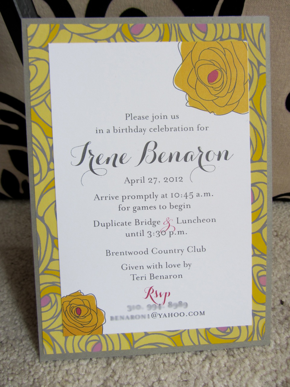
We had the chance to design an invitation and party details for a 90th birthday...
what a special occasion!

The birthday girl (Irene) loves playing bridge, so her daughter held a lovely luncheon where all of Irene's friends could gather to celebrate this momentous occasion,
and play some cards while doing it!

The luncheon was held in the spring, and
we wanted the invitation to reflect the fresh elegance of that time of year. 

Yellow and gray has been an increasingly popular color combination this year, so we used a gray card stock, a floral paper layer, and a white card stock to give the invitations a fresh feel.


We used florals to give the impression of a special occasion, along with a vintage playing card for that (still elegant) element of fun. The playing card and yellow satin ribbon sash served as the enclosure.


We lined the coordinating gray envelopes with a yellow polka dot paper for that pop of whimsy.


The result was a lovely invitation that evokes the special occasion while still being fresh and fun.

Irene's daughter, Teri Benaron, also asked us to design a few coordinating party details.
We designed individual place cards for each lady attending the luncheon.


Using a glitter gold card stock to really give them that special touch, we then added layers of chartreuse card stock and a floral-ly damask patterned paper.
These say, "glamour in the garden" to me!

The tags were then tied to each lady's napkin with a coordinating chartreuse ribbon. Gorgeous!


What elegant birthday party would be complete without favors?
We wrapped each favor with a combination of tissue paper, tulle, ribbon,
and a sprig of coordinating hydrangea.


Here's a quick photo from the actual event (please excuse the blurriness).
Look how gorgeous the favors and place card tags look with the garden leaf overlay!


It was such an honor being part of Irene's special birthday!

This concept of a garden luncheon would be beautiful for a bridal shower or even a baby shower.
When there's attention in the details, each celebration feels special and personalized.

Friday, August 24, 2012

{Frosting Friday} 40th Birthday Party Sneak Peek

Happy Friday!

Today we wanted to give you a sneak peek at a party we threw with an all-white color scheme.

It was a 40th birthday bash on a yacht, for Jillian's husband Tim.

These were just some of the all-white sweets on the dessert table...cupcakes from Magnolia Bakery that we adorned with our custom toppers.


Yacht...cocktails...dancing...cupcakes...could there be a better way to celebrate a 40th birthday? :)

Since Labor Day weekend is right around the corner, and some of you may be planning an all-white party of your own, we wanted to give you some sweet inspiration.

Stay tuned for more photos of this party next week.

And have a wonderful weekend!

Tuesday, August 21, 2012

{Special Project} Survival Kits

Ever wondered how to break the ice with a new group of people? Whether it be coworkers, organization members, or colleagues, sometimes its nice to have an "ice breaker" activity to help get the conversation flowing.

We wanted to share a recent project we did for Medtronic to serve this purpose.

We put together a "Survival Kit" to help the team members during their board meeting to get to know each other, build morale, and to realize they are all in the same boat together.


We simply filled a kraft paper bag with all kinds of goodies....


How are all these items significant, you may wonder?
Read the custom tag below :)


We attached this custom tag to each bag to add that personal touch.


A sweet way to get to know one another and motivate teamwork, don't ya think?

Let us know if your company/group/class is needing an ice breaker activity like this survival kit...we are happy to customize the kit to you and create a custom tag with your logo on it! :)


It's guaranteed to be a hit!

Friday, August 17, 2012

{Frosting Friday} Frosty Margarita Bachelorette Party

How yummy does this look right now? :)

Photo via Pinterest

In this post we'll show you how this "frosty" beverage inspired this frosted bachelorette party invitation.


Our client asked us to design a bachelorette party invitation for her sister. They would be celebrating on a margarita fiesta cruise...sounds like a blast right?

We wanted the invitation to set the tone for the occasion with bright, summery colors and an enticing theme. We used a turquoise enclosure and an anchor motif to represent the water/cruising aspect of the party. 


The cotton cord tying the enclosure also coordinated with the boating theme, as well as gave it a corset-y feel. The margarita-green card stock dipped in glitter "rock salt" evokes the margarita that was part of our inspiration.


The bright pink, green, and turquoise color scheme say summer fun while while the sparkly "salt" on the top makes me want a margarita! :)


Cruising, dancing, margaritas with the girls...this bachelorette party is sure to be a fabulous time!

To see the rest of our inspiration for this invitation, check out our inspiration board on Pinterest.


Cheers!

Have a fabulous weekend!

Related Posts Plugin for WordPress, Blogger...