It gives us great joy and excitement here at 2 Hearts B 1 Designs when a bride we have worked with refers us to a new bride. It provides us with an instant connection, sort of like when a friend introduces you to one of their friends. This was the case when I received the call from Brittany and got the chance to meet her at Starbucks for a cup of joe. We gabbed about weddings and the vision that she had for her own.
I loved the ocean blue color that was her inspiration--it pops and catches your eye. So we decided on a metallic blue ink for the wedding addresses which brought some sheen to the matte envelopes.
For the reception details, Brittany and I had a consultation in which she came prepared with visuals and inspiration. The images and samples she brought expressed the style, look, and feel that she wanted to convey in her wedding and for her guests to experience.
As a designer, I often keep scraps or swatches of paper in case paper details come up in which I can use them and incorporate them in a creative new way. Luckily, I had the clever thought to tear out and keep the liners from Brittany's unused wedding envelopes. Which had a mosaic feel to it! I was able to use these leftover liners as sashes and borders on her reception cards.
I loved the pure joy that came to Brittany as she looked at the details we created, happily surprised and astonished that I could not only meet her expectations but exceed them.
We used pure white card stock and navy blue ink, representing the union of ocean and sky, and celebrating the union of Brittany and Javier.
Thank you for allowing us to be a part of your special day. These fabulous photos are credited to Gary & Courtney's fabulous eye; I absolutely fell in love with these shots. Take a look at more in their gallery.
The artistry of this photo is just eye catching!
 |
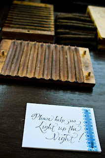
| Brittany and Javier had a cigar rolling station for everyone to take a puff and light up the night! It was a joy creating their signage. |
Looks like two kids running off and getting married. How adorable is that!

Wrapping ribbon around each drink with mosaic border and calligraphy by 2 Hearts B 1.
Cheers to a beautiful day and a beautiful bride!
What a lovely table scape that identifies with the beach, sand, and surf of Cabo!

Menus tucked inside ocean blue napkins and pure white flat place cards adorning each guests' name in navy blue ink calligraphy.
Every couple should have a picture like this. Just breath taking!
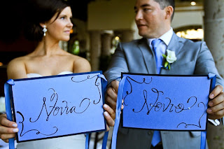
Brittany & Javier had the clever idea of putting some Espanol into play with her bride and groom chairs. We made these decorative signs and adorned them with fun embellishments to capture the same feel to the event with shimmer blues that reflect the ocean scene.
The happy couple thought it would be a nice treat to have this vintage suit case that we made the signage for with distressed edged paper and postage stamps and travel themed related adornments to direct their guests to drop postcards sending well wishes to the bride and groom.
Isn't this a clever way of celebrating instead of rice or flower petals, the use of ribbon wands. So easy to create and make. What a fun picture it makes as well. It's a party! So glad that we got the chance to be a part of such a special day.
Brittany and Javier's wedding is also featured on Style Me Pretty at this time, take a look here.
Thank you Brittany and Javier for the fabulous shout out!
Congratulations on your beautiful day!


 2 Hearts B 1 Designs
 2 Hearts B 1 Designs


1 comment:
Thanks for the beautiful post and kind words! LOVED working with you!!!
xoxo,
Brittany Mosquera
Post a Comment